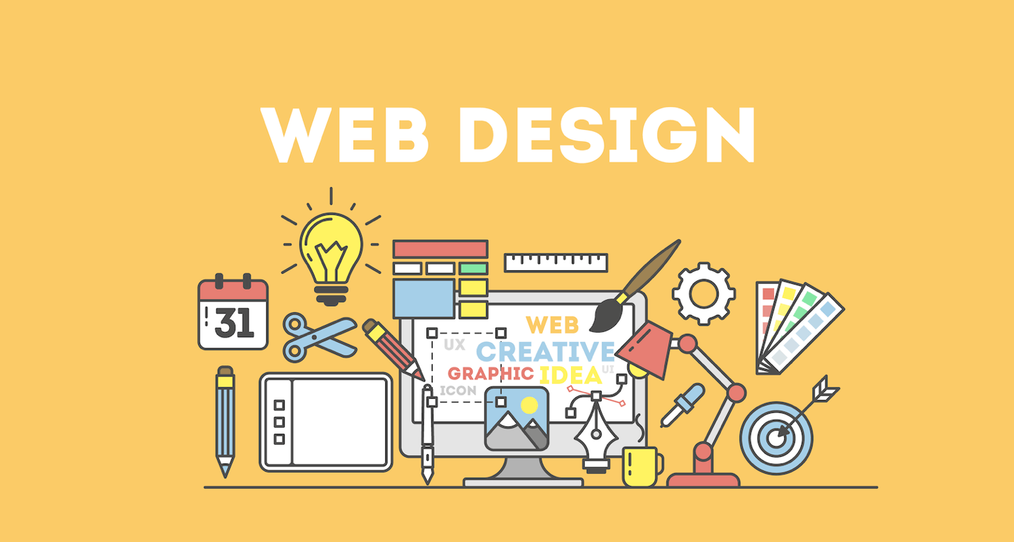
For a website design in DFW to be successful, the conversion rate and revenue alignment of the company are crucial. The percentage of unique visitors who complete an action is called the conversion rate. When it comes to influencing conversion, design is both fundamental and important. A website’s design encompasses more than just its visual appeal, typography, and initial impression; it also takes into account the site’s usability, user interaction, KPIs, consumer insights, marketing objectives, individual profiles, and design trend reports.
This post will go over some of the more technical aspects of how designers and DFW website design affect conversion rates.
Establish Your Objectives
Establish your objectives before anything else. Before a designer starts a project, the organization’s objectives should be defined. First, you must evaluate the data that comes from in-depth conversations with stakeholders. Prioritizing the website’s goals comes after figuring out their primary, secondary, and tertiary functions. Priorities should inform website design, and campaigns and programmes to be integrated in order to support these goals. This way, visitors will see precisely what they need to convert into leads.

Get to Know Your Customers
Having a comprehensive and multifaceted understanding of the users is a task for website design in DFW. Collecting details regarding the potential audience that the product is intended to appeal to is the goal of user research. It is necessary for a designer to perform the role of a researcher or to collaborate with the research team. This will help them acquire the maximum amount of information and analyze it in order to develop design solutions that are tailored to the needs of users.
Master the Principles of Color Theory
Websites that use colors effectively convey information, inspire positive feelings, and dominate the visual space. It only takes people about 90 seconds from the moment they first interact with a website before they make a decision. The use of color alone accounts for between 62% and 90% of the complete evaluation. A product’s ability to stand out from the competition, as well as consumers’ perceptions of the brand and their feelings towards it, are all impacted by the colors used effectively. Landing pages, backgrounds, graphics, headlines, borders, products, pop ups, etc all need to work together in harmony, so picking the correct color scheme is crucial for driving conversion.
Clear and concise writing
A user-friendly DFW website design makes it easier for them to consume content and understand the objectives with its clear, high-contrast typography and logical hierarchy of information. To achieve the appearance of a well-coordinated design, it is essential that the heading, subheading, and important content be distinct from one another while still being balanced using various fonts, sizes, and colors. Consistent fonts on a website make their purpose more apparent to the user. The use of suitable words is another critical component of readability. Users’ attention spans have shrunk due to an abundance of options, according to numerous surveys. This is where well-written content comes in; an improved website is the result of well-written content.
An Intense Call to Action
A call to action button that has been thoughtfully & strategically designed is intended to be user-friendly and convincing. It should also inspire the user to take the intended action your business model wants. The CTA buttons on a website are typically placed in a prominent location and are highlighted to the extent that they encourage users to sign up, download content, or make a purchase, among other things. To ensure that the CTA button is positioned appropriately, a designer must first understand the objectives of the user and then, later on, investigate how each action moves the user closer to achieving those objectives. Providing the appropriate amount of visual weight to each CTA button and ensuring that the flow is intuitive are the two most important aspects.
Understanding Analytics
Nobody can be satisfied and embrace a single design. It is the responsibility of the designer from the DFW website design company to ensure that the design is balanced, easy to use, and intuitive. Analytics step in to help figure out what does and does not work. A designer can then prioritize design needs in accordance with users and relevant metrics. Analytics facilitate design decisions by revealing user behaviors across various categories and regions. The project’s analytics should be in sync from the get-go. In order to get analytics, designers shouldn’t restrict the research methods. Combine different approaches, consult with relevant parties to gather data, and then use that information to inform your design decisions.
Lastly, just like with everything else that is online, new website designs, technologies, devices, and trends bring about a completely new set of challenges with each and every project. An approach that prioritizes the objectives, goals, visitors, visual appeal, usability, performance, analytics, and trends in design is likely to yield a user-friendly and responsive design that influences the conversion rate of a website. Although there is no one definite method for creating a perfect website, there are methods by expert professionals for the DFW website design that are likely to produce such a design.
Transform your online success with DFW Website SEO!
Are you willing to discover how website design can dramatically improve conversion rates in the Dallas-Fort Worth area? Or want to improve user experiences, captivate your audience, and watch your conversion rates skyrocket? The expert team at DFW Website SEO expert can help you unleash the power of compelling design. Let’s create a website design in DFW that not only looks great but also converts visitors into loyal customers.

CORPORATE OFFICE
2001 N Lamar Street
Suite Number 270
Dallas, TX 75202


